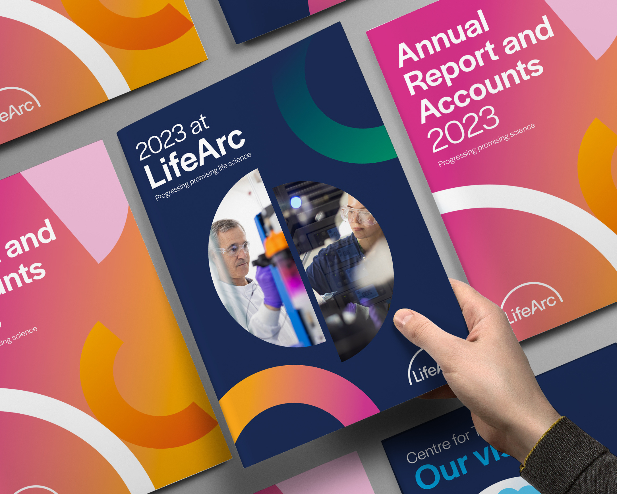
In the world of medical research, it’s vital that we keep challenging ourselves to push forwards. We’ve created a new brand to truly reflect our evolution and new strategy, and symbolise to our partners and friends that LifeArc has changed.
We are no longer just funding promising research and humanising antibodies. LifeArc is here to convene the UK’s early translational science ecosystem – to empower scientists, to promote promising discoveries, to partner with and connect key players in our ecosystem, and to make sure we make an impact on patients’ lives.
Our rebrand journey
The process of building our new brand didn’t come without its challenges. To get the brand to the point that Katy Haylock, our Head of Brand, and I were both happy with the result, took us down to the wire.
We started by simply asking our employees how they felt about our brand identity. Were they proud of how it represented us? Did it communicate who we are?
The overwhelming answer was no. Sentiments included “It’s not us!”, “The brand and logo feel outdated,” and “It’s too green!”.
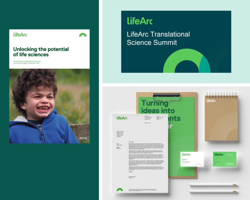
Then we spoke to some of our partners and realised that we had so much more work to do to help them understand our recent, fast-paced evolution in early translational science.
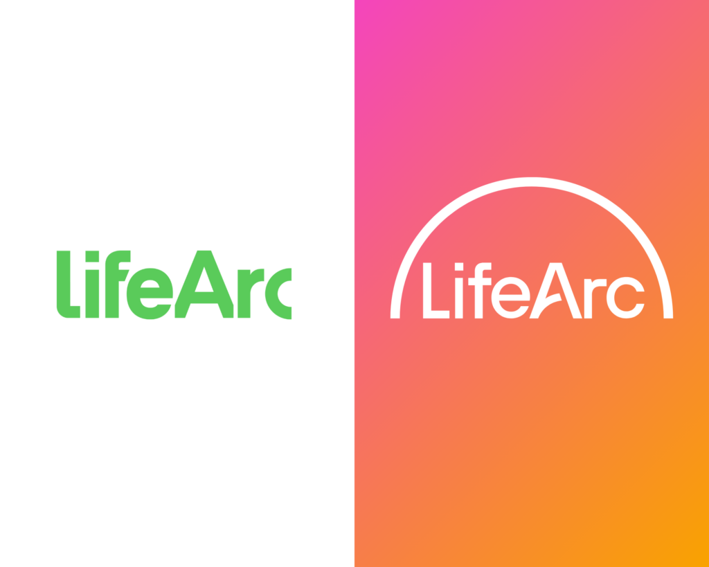
So, Katy and I embarked on a journey to discover the visual language we wanted to embody the evolved LifeArc. We worked with a design agency, tothepoint, to develop our new logo, preserving elements from our old brand (like the arc) and instilling new modern and minimal elements to mark our change.
And then came the hard part. After exploring dozens of paths for a new visual identity and driving Katy insane with endless tweaks, something was missing. Despite the great designs, they just didn’t ‘click’ and at times, it felt like we were never going to get a visual language that we love.
I was so excited about representing the amazing work we do, and while I felt that we were close, the cherry on the top eluded us. We finally got there thanks to a stroke of genius from Katy.
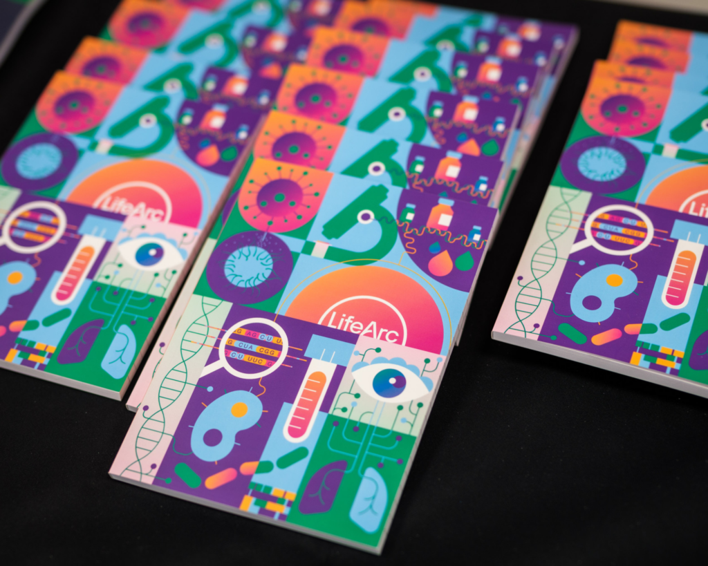
Her design for a notebook cover for our annual conference caught my attention: it was clever, curious and up beat. The moment I saw it, I knew it was that spark we were missing. This simple notebook design gave us that look and feel which differentiated us from other medical research organisations.
With the design elements finally falling into place, it was time to tackle another piece of the brand that was eluding us: the perfect colours.
We then worked together with the design agency ThreeTenSeven to help us resolve our colours. We loved the initial direction of gradients, which visually represent translation from the lab to the patient, but found it very hard to scale it up. Plus, they evoked strong reactions. We found that the blue was too cold and the yellow-purple was a challenging gradient to use widely.
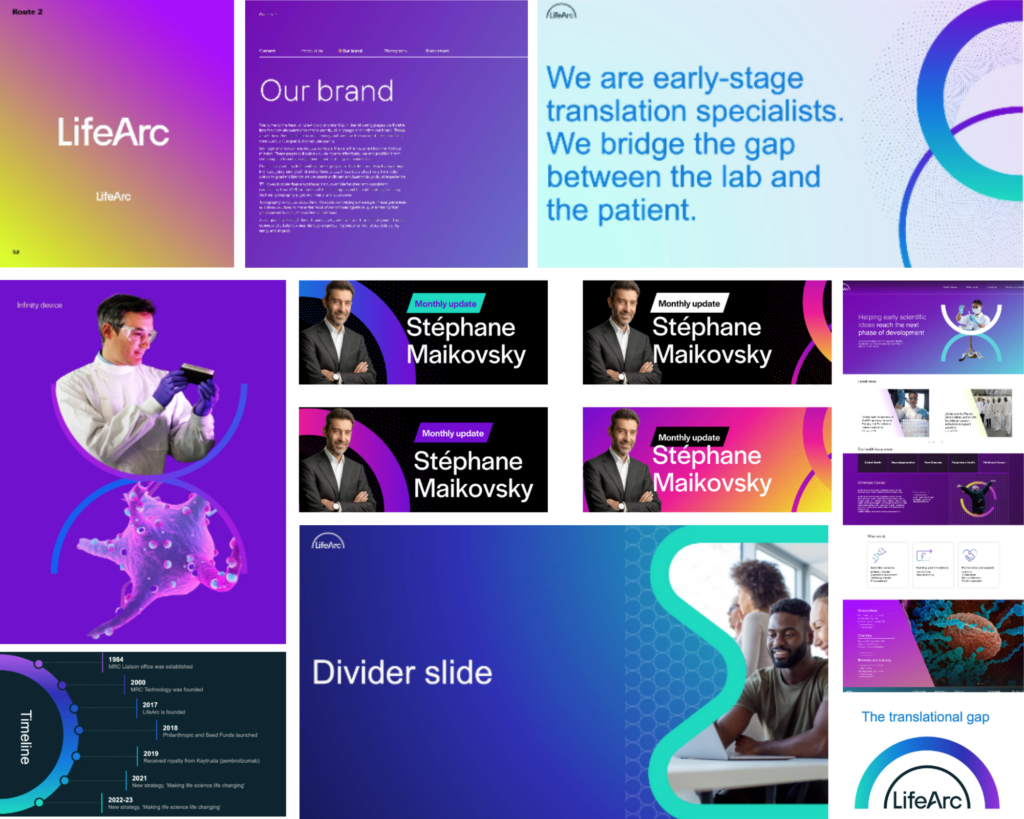
How we finalised our visual identity
Eventually, we took some of ThreeTenSeven’s ideas and combined them with a consistent, diverse colour scheme, choosing not to have a lead colour.
Why? LifeArc is working on so many projects and initiatives, that we felt we should keep LifeArc as a neutral platform which is not based on a colour. The colours are there to fill in and represent our projects, partners, scientists and patients.
This was not an easy decision but once we made it, it felt right and we knew we should stick to it. It doesn’t mean we don’t have brand colours, it just means we don’t lead with one or two of them.

You can see more examples of our new gradients here.
Where to now?
Now that we have launched our new brand and website, the work won’t stop. It’s just the beginning, it’s the birth of the new LifeArc identity and it will have a learning phase and possibly some growing pains as we roll it out more broadly.
But that’s okay, it will keep evolving with us and with LifeArc’s future initiatives, and we are so excited about the foundation we’ve created.
You can see more examples of our process and thoughts in the Miro board here.
You can find our new brand guidelines here.
About the author
Michael Motskin
Michael Motskin, a Cambridge PhD graduate in nanobiology, combines scientific expertise with a flair for brand, marketing and events.
He’s also a co-founder of Pint of Science, a platform that brings together researchers and the public to discuss exciting scientific advancements over a pint.

